
Cards Block
The Cards block can be used to highlight a list or series of related projects, programs, events, or other information. You can choose to display between 2-9 cards per block. Cards are organized in a grid and each card can be customized individually through the settings.
Best Practices
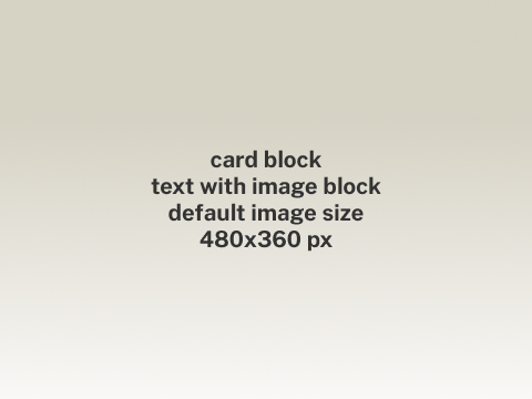
- Image size is 480px x 360px. Image dimension is 4x3.
- Keep text concise. A short description is normally the best option for a card. Link the card to a new page for more detailed and lengthy information.
- Double-click the text in the card or the button to edit it.
This caption describes the image above.
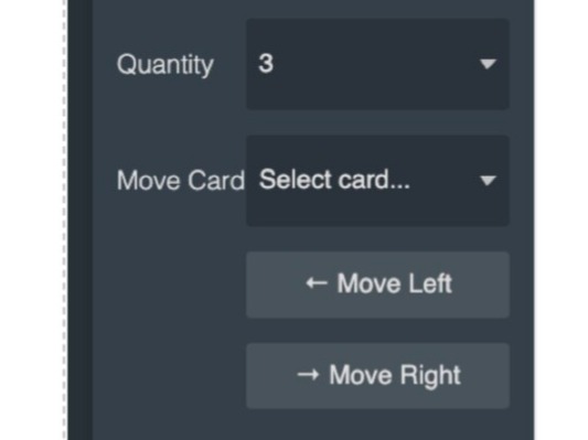
Reordering Cards
In the Settings panel you can use the Move Card function to change the order of the cards in a Cards block.
- Select the Cards block.
- In the Setting panel use the dropdown to select the card you want to move. The dropdown will show the title of the card in the Cards block.
- Use the Move Left or Move Right buttons to change the position of the selected card in the Cards block.
Settings
Cards
- Quantity: you can pick between 2 and 9 cards per block
Card
The Cards block has multiple Card blocks nested in it. Be sure to select the card you want to apply settings to. Selected elements are indicated by a blue outline.
- Theme: orange, blue [discontinued, will not change on page]
- Image: first (image on top), last (image on bottom), or none
- Alt Text: If you use an image, you must include descriptive alt text
- Button: yes/no
- Photo Credit: text field to provide photography rights information (optional)
Button
- Title: (optional) description of the button text or destination
- URL: link to new page or website
- Target: load the link contents in the current window/tab or a new window/tab

Cards block settings

Card settings
updated March 23, 2026